101 Things To Do Magazine
Senior Graphic Designer / Production Manager
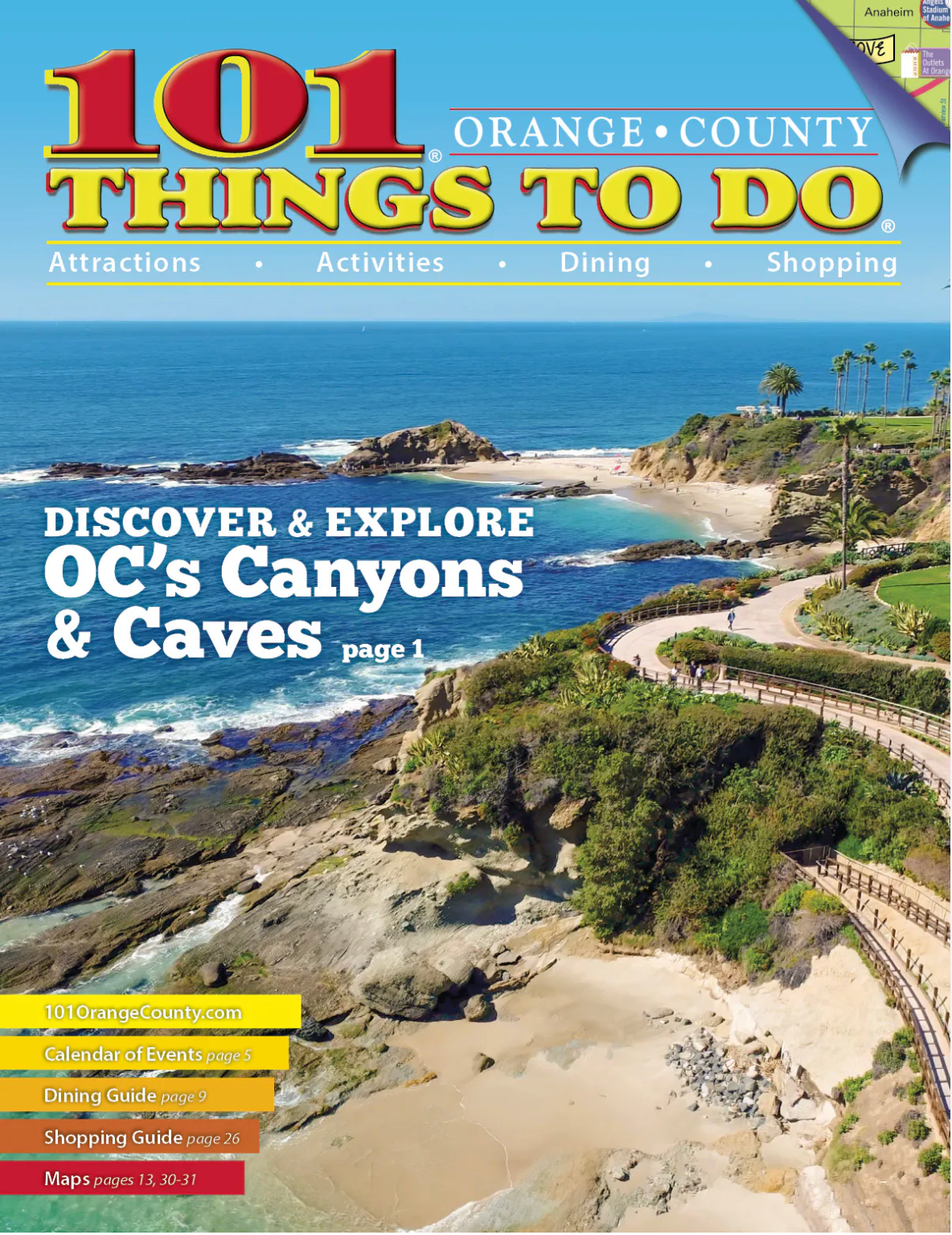
Over a 5 year span, I aided 101 Things To Do Magazine's to grow from 1 publication and website to 4 publications and 4 websites. Including the following: 101 Things To Do Orange County, Palm Springs, Phoenix, and San Diego.
Key Accomplishments:
• Responsible for designing three quarterly 60-page, high-volume, print (and digital) publications and 2 gatefold coupon/map inserts using Adobe CS6. As well as designing 90% off ads that run inside the magazines and inserts
• Credited with the concept of the ads and logos for 90% of the clients in the publication. As well as 100% of in-house sales tools, i.e. media kits, schedules, PowerPoint presentations, price sheets, etc...
• Concept and design magazine covers
• Supervise and art direct photoshoots
• Organize and brain-stormed email campaigns, direct social media presence, contests and virtual events to further the brand’s reach and build clientele. Admin/Webmaster for five WordPress websites
• Responsible for hiring and training a staff of 2-5 employees.
• Brainstorm/concept fresh ideas with team members, seeing projects through from concept to completion
• Slashed expenses by renegotiating print vendor costs, increasing company profit per client contract
• Schedule project timelines and produce reports
• Increased online revenue by implementing internet and event marketing programs
• Maintain company files on Office 365 Cloud and local shared server
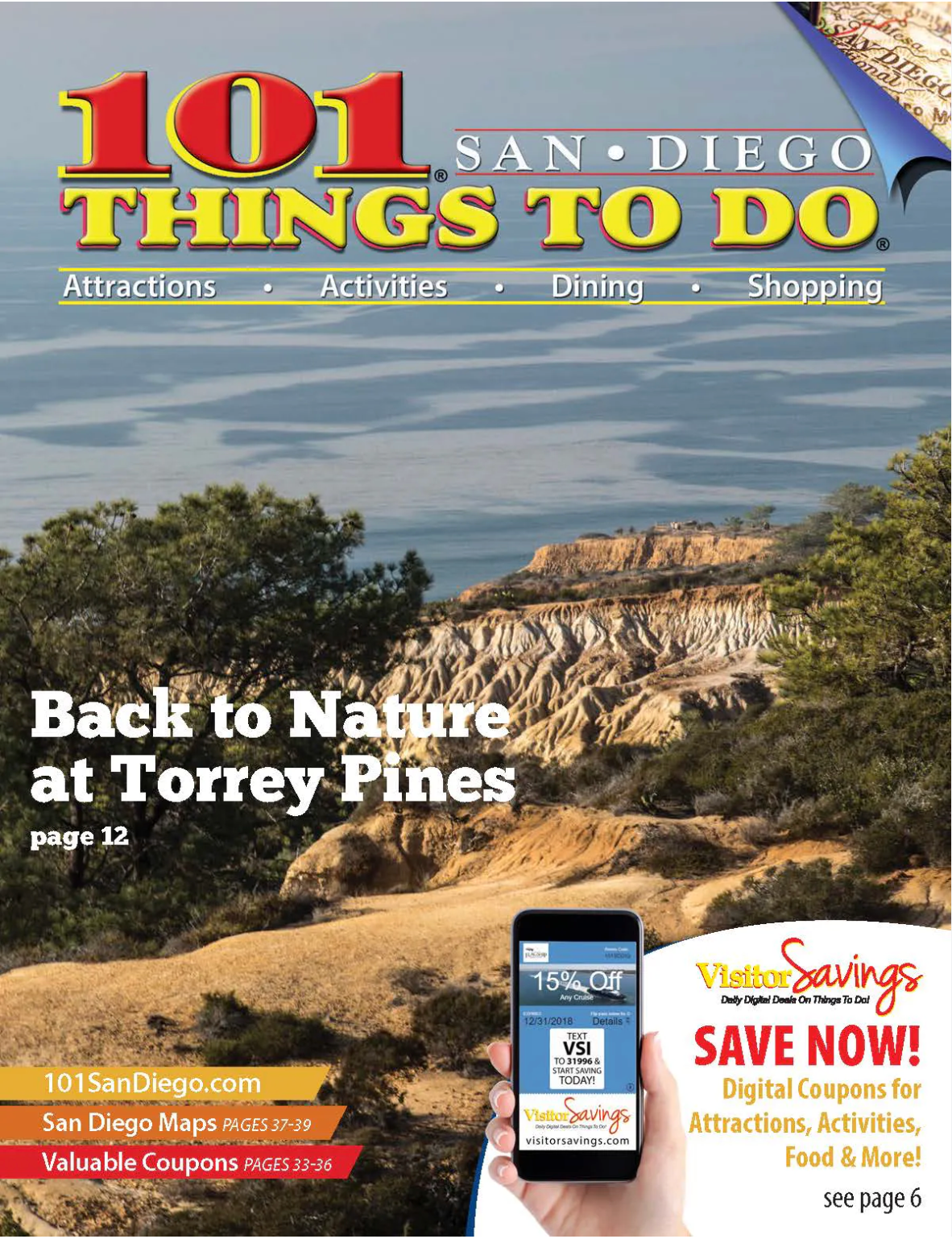
101 Things To Do Orange County magazine
Designed/layout of a 32-60 page quarterly publication
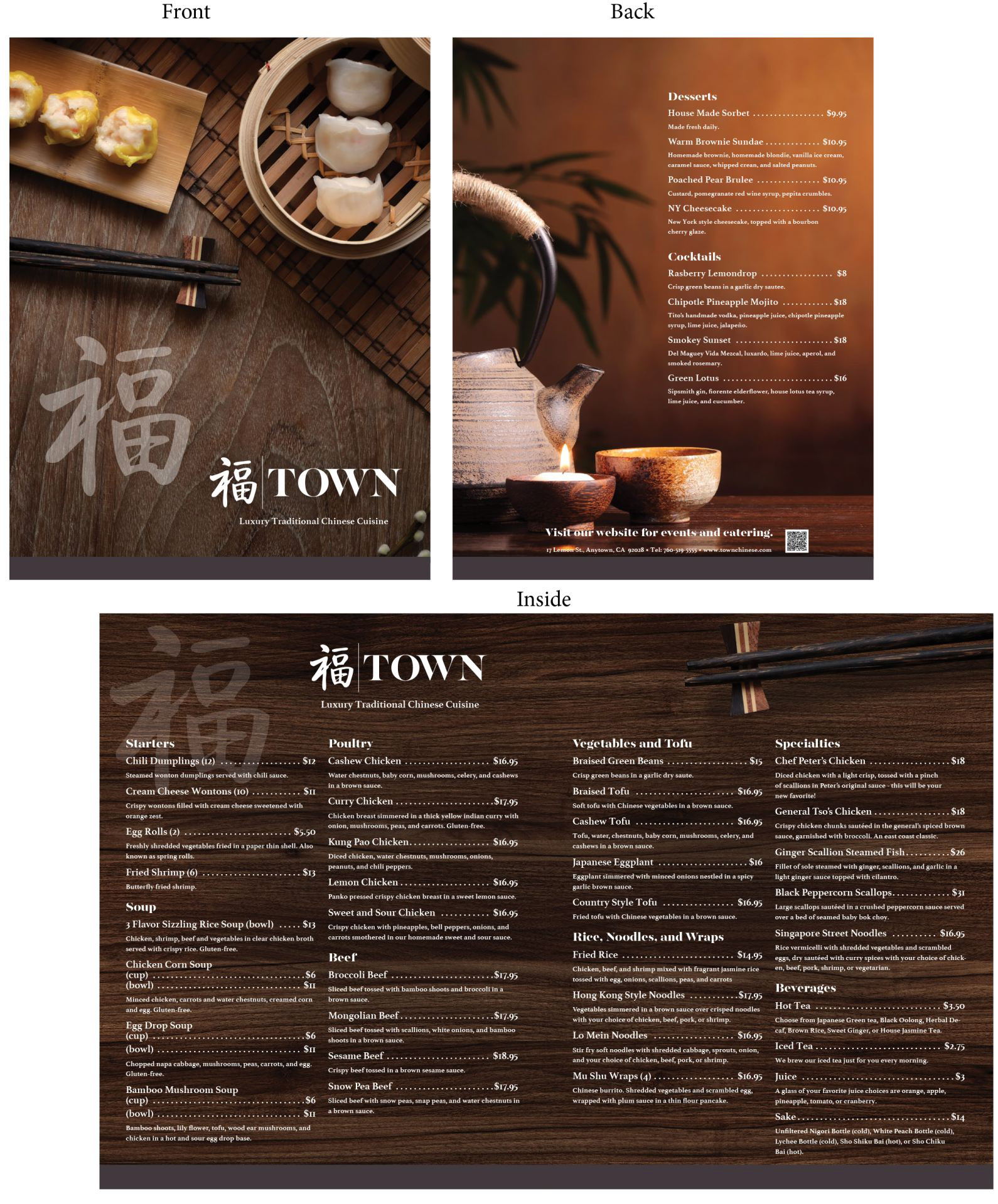
Town Chinese Menu
This menu was created using Adobe InDesign, which is ideal for managing multi-page documents and maintaining consistent design elements across spreads. A four-column grid structure was used to ensure precise alignment and organization of content, contributing to a clean and balanced layout.
The visual theme is inspired by natural elements, with a wood and bamboo background that guided the choice of a warm, brown-based color palette. This creates a cohesive and inviting aesthetic that complements the dining experience.
Close attention was paid to typographic and spatial details. The spacing between menu items is uniform, and consistent padding follows each header, reinforcing visual hierarchy and readability. The layout also accounts for practical considerations: a gutter down the center ensures a clean fold line, and a custom QR code was integrated for added functionality and digital access.
This design is also cost-effective, printed on a single 11”x17” sheet of paper folded in half, minimizing printing costs while still offering a professional, high-impact piece.