Areas of pharmacogenomics illustration
I used a lot of creative self-expression when designing this graphic. I think it’s wonderful to be blessed with a job that allows you to explore your creative prowess by creating a design from nothing and get paid for it. It nourishes one’s self-esteem and self-acceptance in a relaxing way.
I did follow the feedback that I was given. Originally, the background was dark gray. The client asked to change it to purple, but that was too dark, so we agreed on the light blue. Also, they wanted to change the “Polypharmacy populations” image from a bottle to something else and I came up with this basket. I also redrew the heads of the people to make them all small and changed the shadows that they are standing on along with all of the colors so that they all worked well with each other and didn’t clash.
The client needed an image that demonstrated the different disease areas that PGx testing can be utilized. The disease areas are Psychiatry and Mental Health, Cardiology, oncology, pain management, Perioperative care, and post-operative care. The Mental Health and Pain management illustrations were provided, but I had to find (and tweak) the other illustrations.

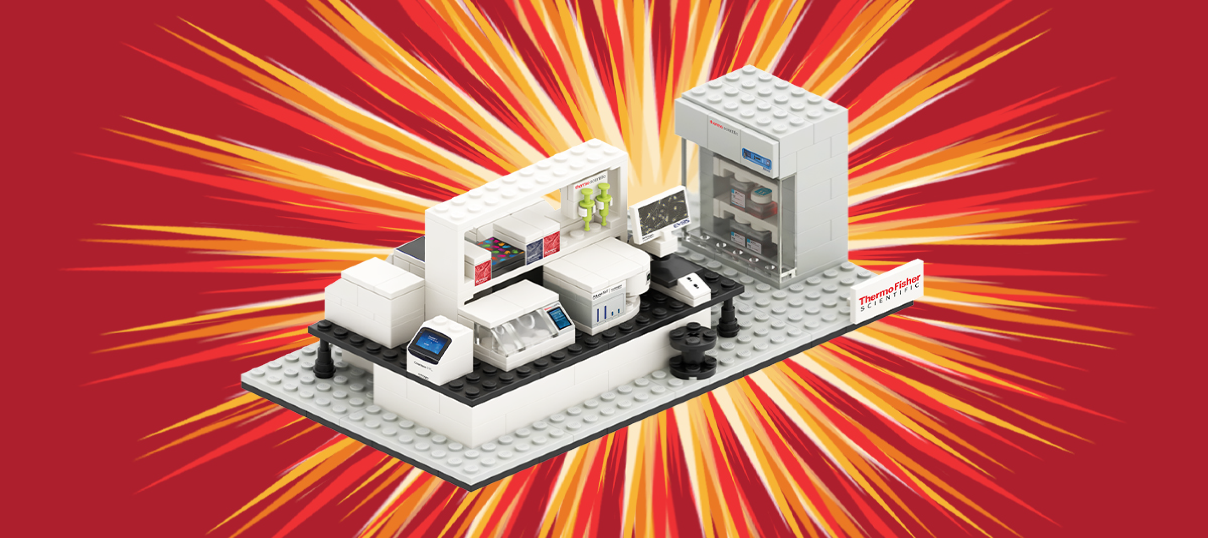
Promo item – Lego lab set
I was provided a photo of the lego set and was asked to make it pop out like a comic onomatopoeia. I used Illustrator to create this image that was used for email headers, flyer headers, website external banners, and email signatures.
Client: Thermo Fisher Scientific
Predictive Genomics header
I used Photoshop to create this design because it will be used in many ways (e.g. flyer header, web page header, web banner ads, email headers). The client came up with the idea to have a type of a rubex cube with people super imposed in the cube. There is a lot of attention to detail with this image in the shadows that show space and gradients in the background as well as in the cubes.
Client feedback: "Hey Jen, Thank you for taking our call yesterday and working on the PG graphics (the cube). This looks great and is approved!"

3 for 2 Promotion
This imagery was created in Photoshop. I used line, color, shape, form, value, and space. I also used repetition of patterns, shapes and colors as well as movement. I received a lot of feedback when creating this graphic. The imagery was used in print ads, email headers, and banner ads on websites.

Nose and Heart Icons
There were very specific rules to follow when creating icons for Thermo Fisher Scientific. The design language for the iconography is simple, clear, and consistent. It is at once friendly, sophisticated, solid and smart.
Circular framework The design originates within a circle and is based on the rule of thirds. Spacing and layout is highly structured within a logical grid.
3D flat Three-dimensional subjects are rendered in a flat style, capturing the angles and relationships of three-dimensionality in the prescribed sizes, line weights and flat styles of the iconography.
Tactility Tactility is reserved for interactive elements and actionable items. Icons feel pushable, and objects seem grabbable.
Target line weights Primary, secondary, and tertiary line weights provide consistency in the positive and negative space.